Fictional Project — Beverage Brand
Bubbles - Sea's Treasure
College Assignment


🧋 Overview
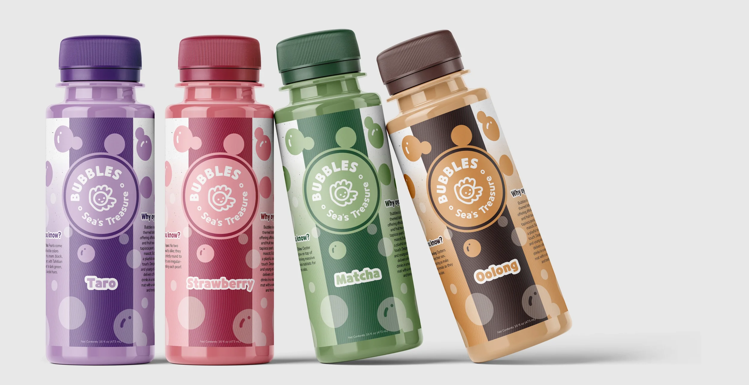
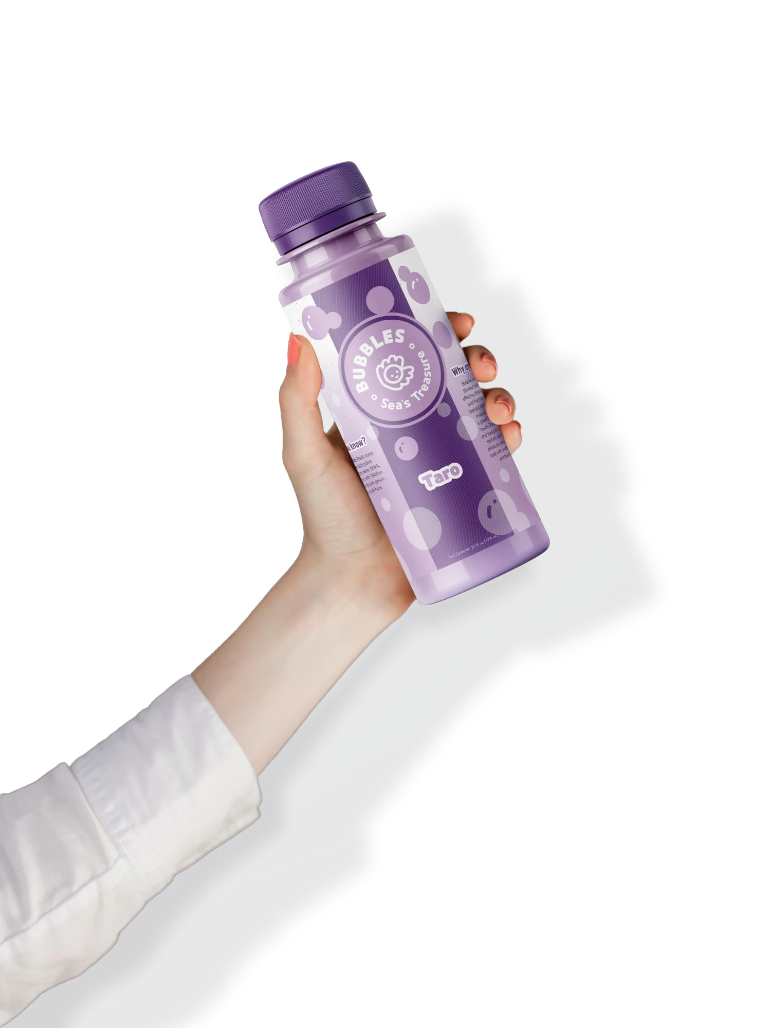
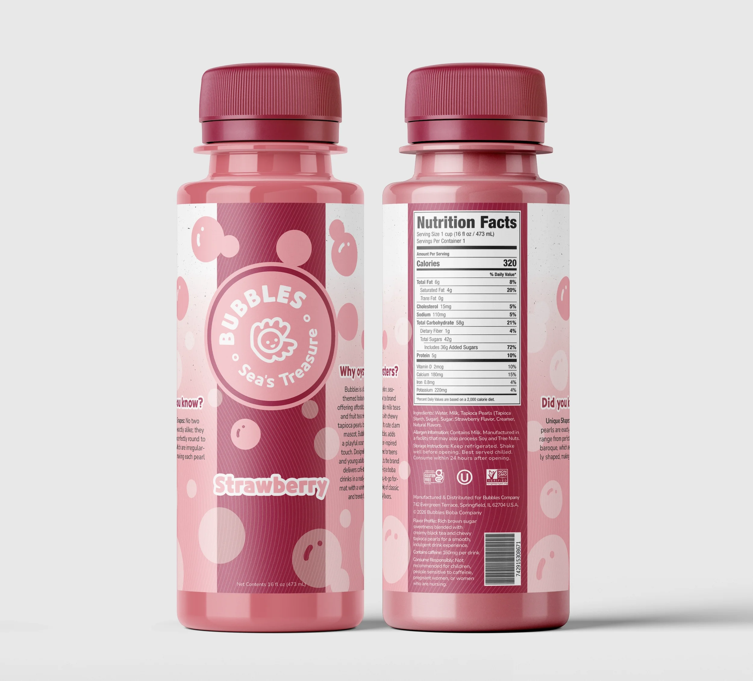
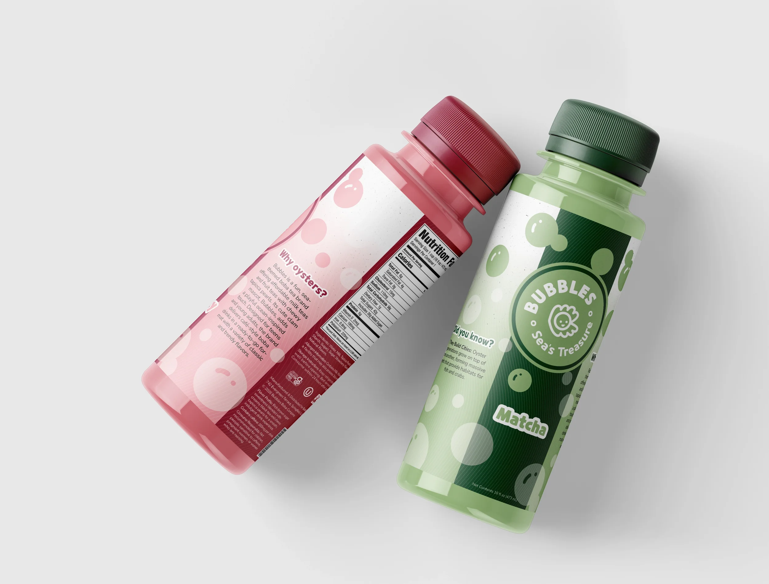
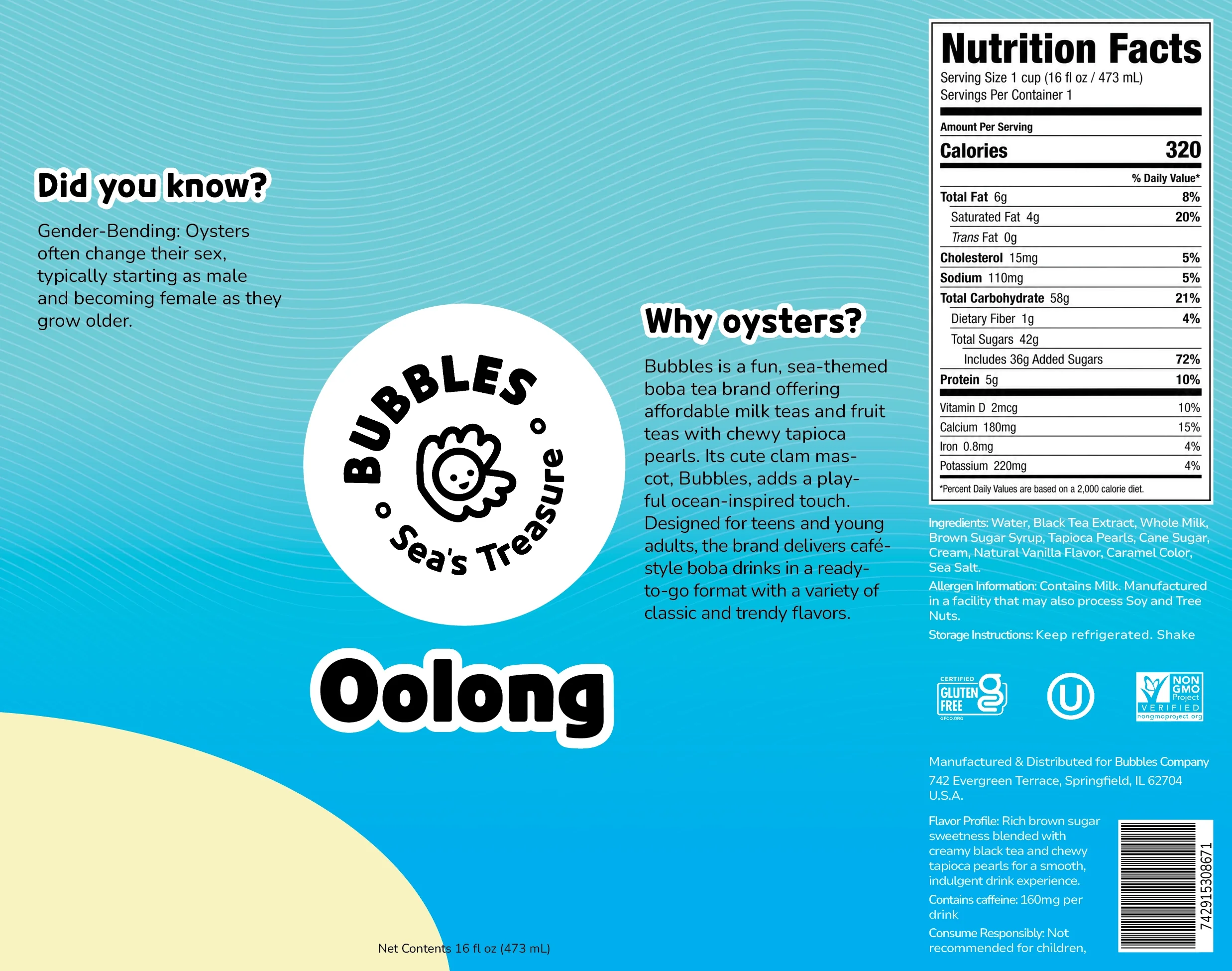
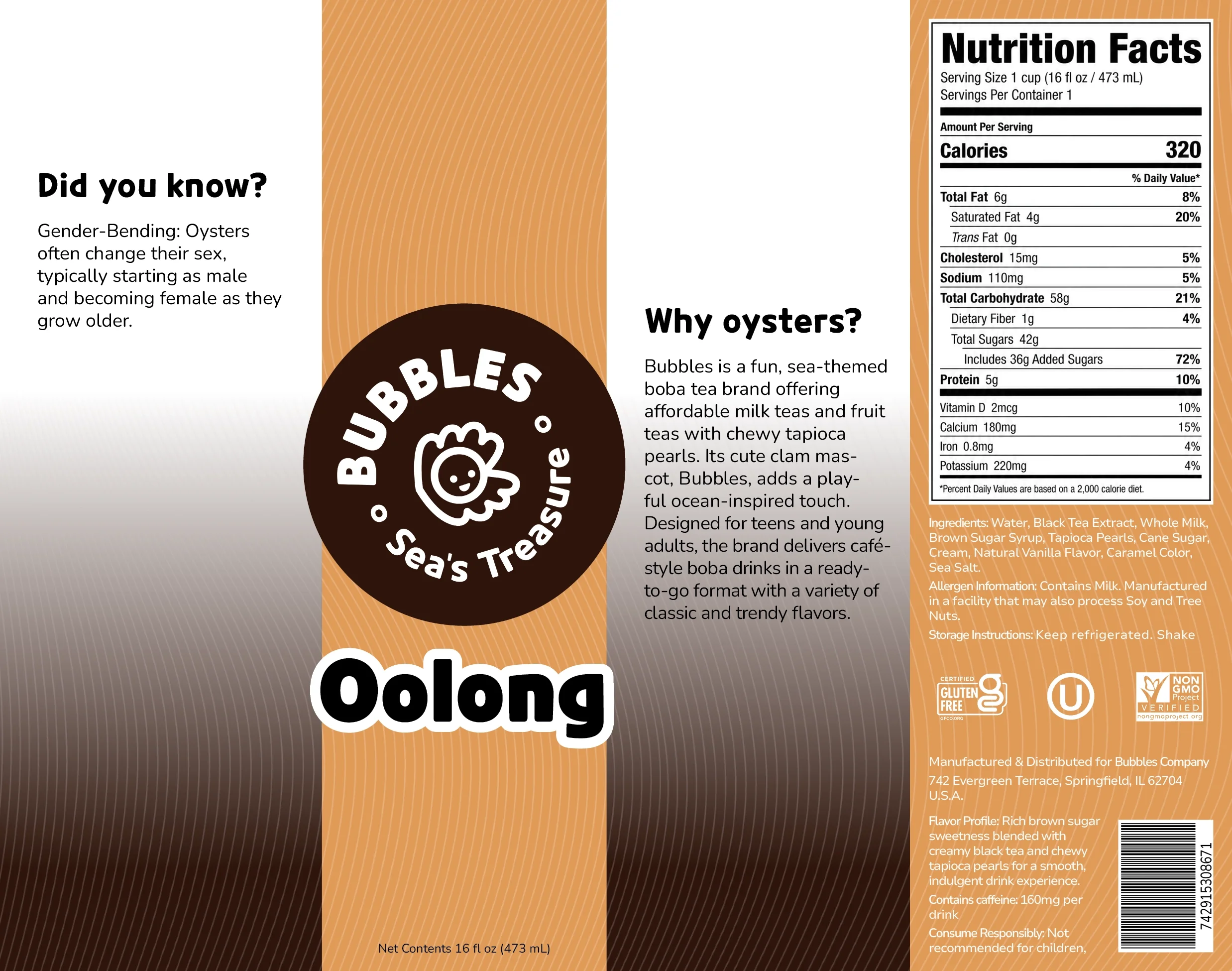
Bubbles is a fun, sea-themed boba tea brand offering affordable milk teas and fruit teas with chewy tapioca pearls. Its cute oyster mascot, Bubbles, adds a playful ocean-inspired touch. Designed for teens and young adults, the brand delivers café-style boba drinks in a ready-to-go format with a variety of classic and trendy flavors.

✏️ Branding
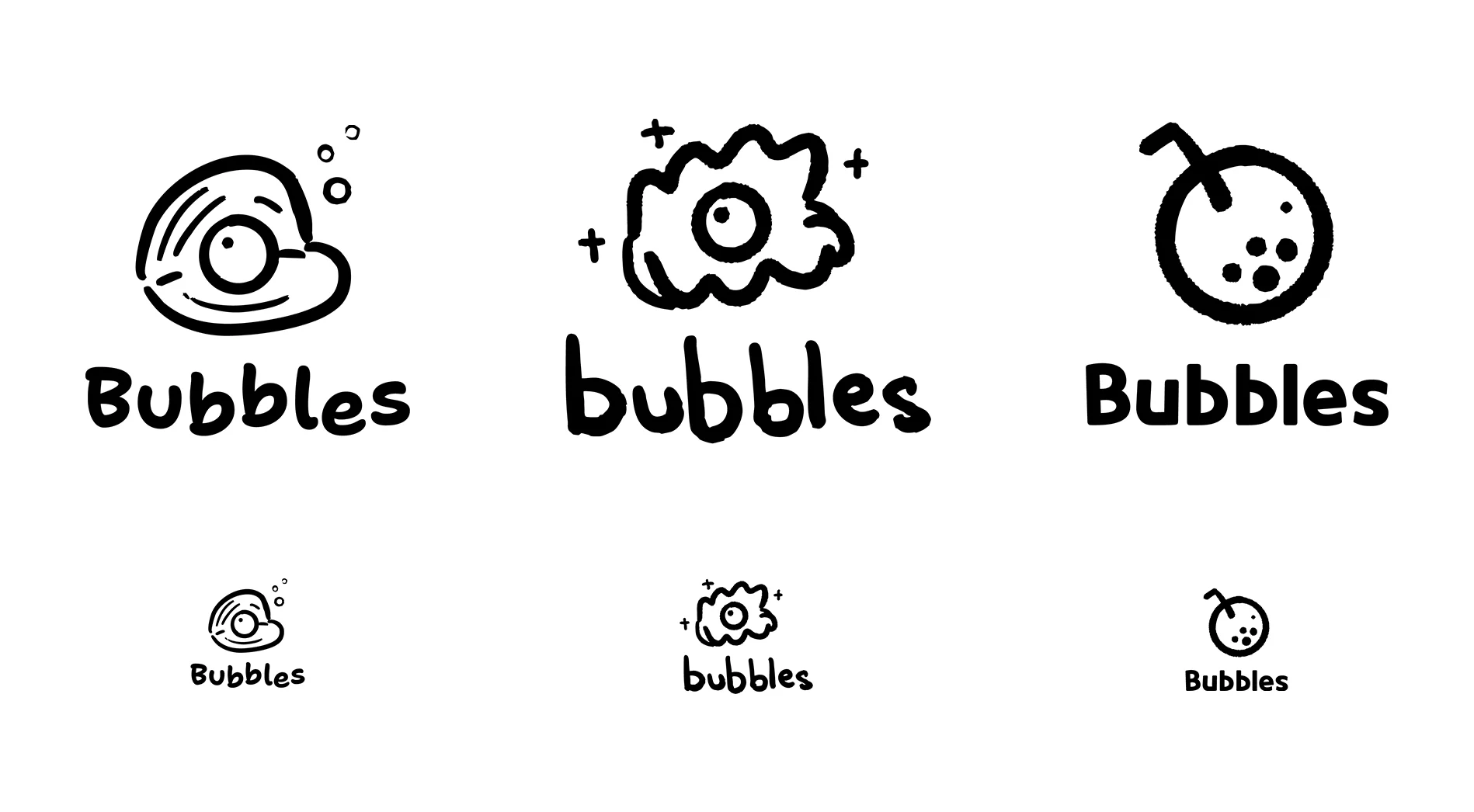
The mission for Bubbles is to sprinkle a little more joy into everyday life by making boba easy to grab and enjoy anywhere. I personally believe that no one should have to choose between making a special trip to a café or wrestling with a DIY kit just to satisfy their bubble tea craving. The idea blossomed from a simple wish: to see colorful, fun boba drinks sitting on store shelves, ready to brighten someone’s day like any other favorite treat. Although the logo during this stage is still taking shape, the vision is for it to be round, playful, and full of charm, inspired by the little boba pearls that make every sip feel like a tiny treasure that has been found.
✏️ Process
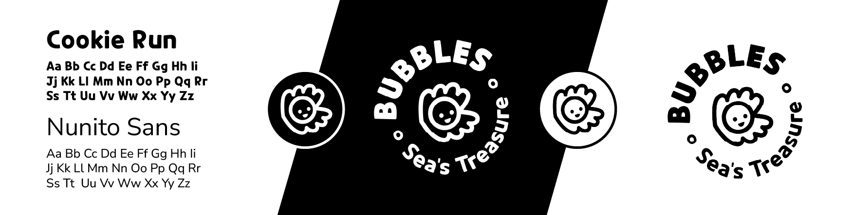
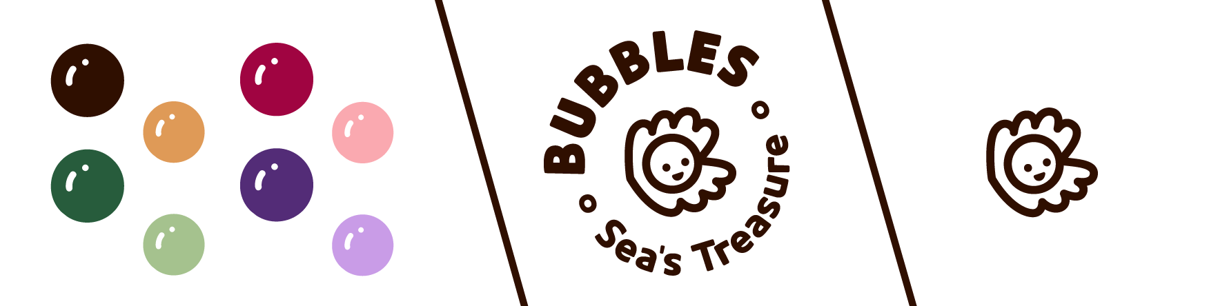
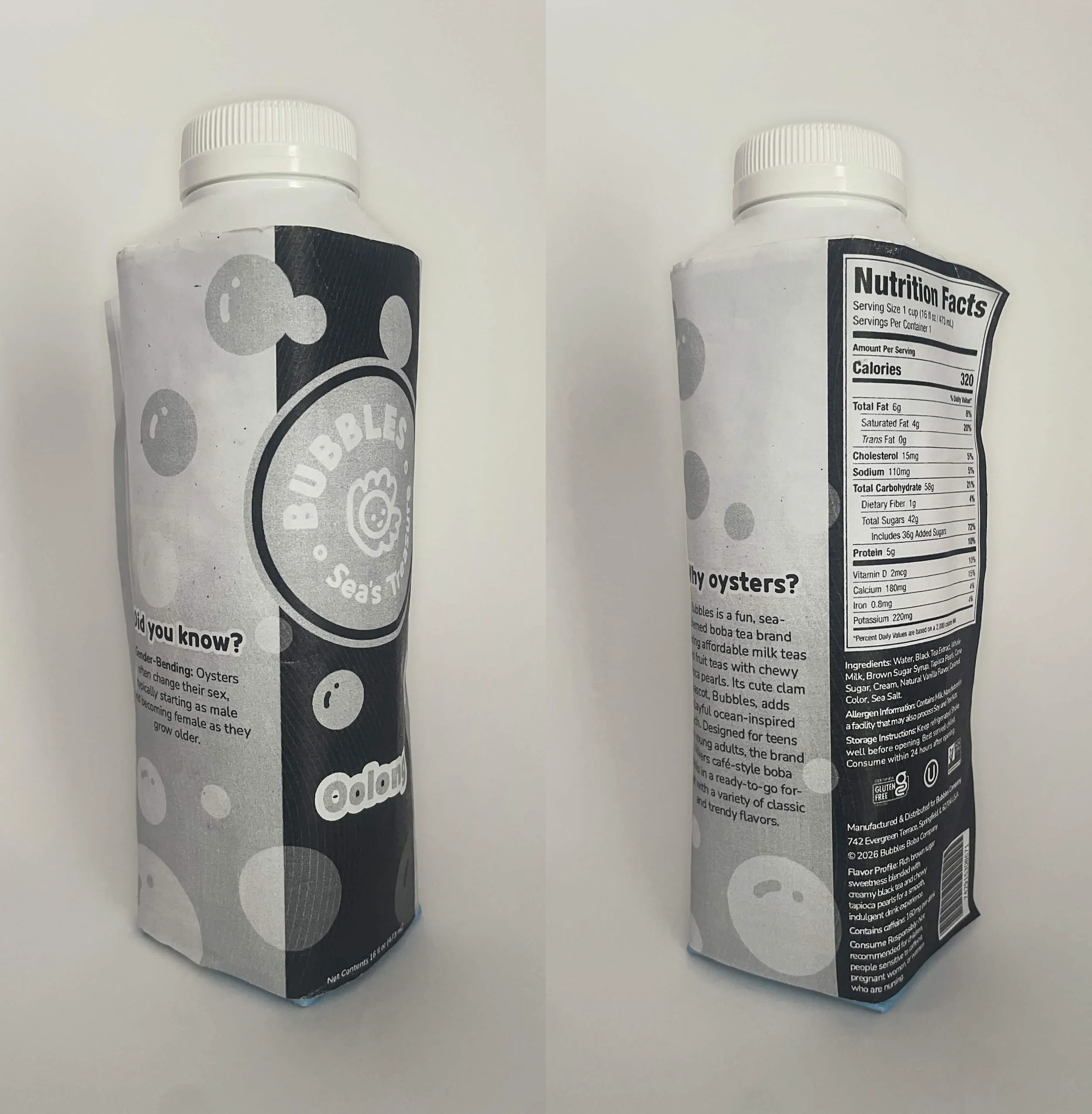
For this project, I developed a visual identity through logo, color, and typography, and paired it with creative and fun writing that is consistent across the brand.
Through research, Bubbles stands out from competitors by reimagining milk tea with a more exciting and playful brand identity. From my perspective, many milk tea products have branding that feels stoic and very chaotic, so my idea is to bring the vibrant and inviting atmosphere of classic boba cafés like Gong cha, Taichi Bubble Tea, Kung Fu Tea, and YAAAS Tea into a bottled supermarket product. From viewing and consuming the product, the beverage is designed to bring happiness and joy to customers and create an enjoyable, relaxing experience. The ideal customer is someone who is excited, sweet, chill, relaxed, and happy.
💻 Website
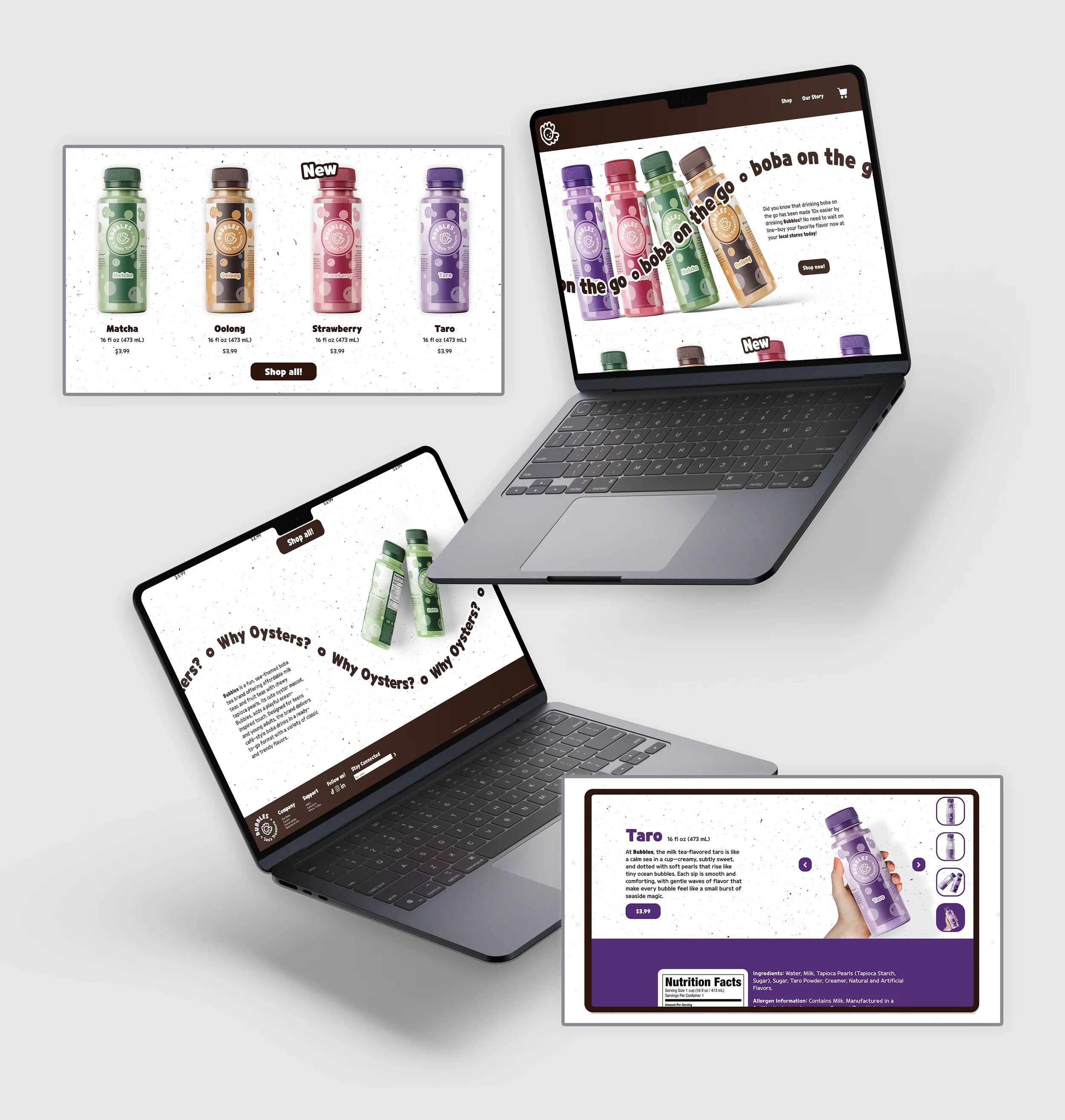
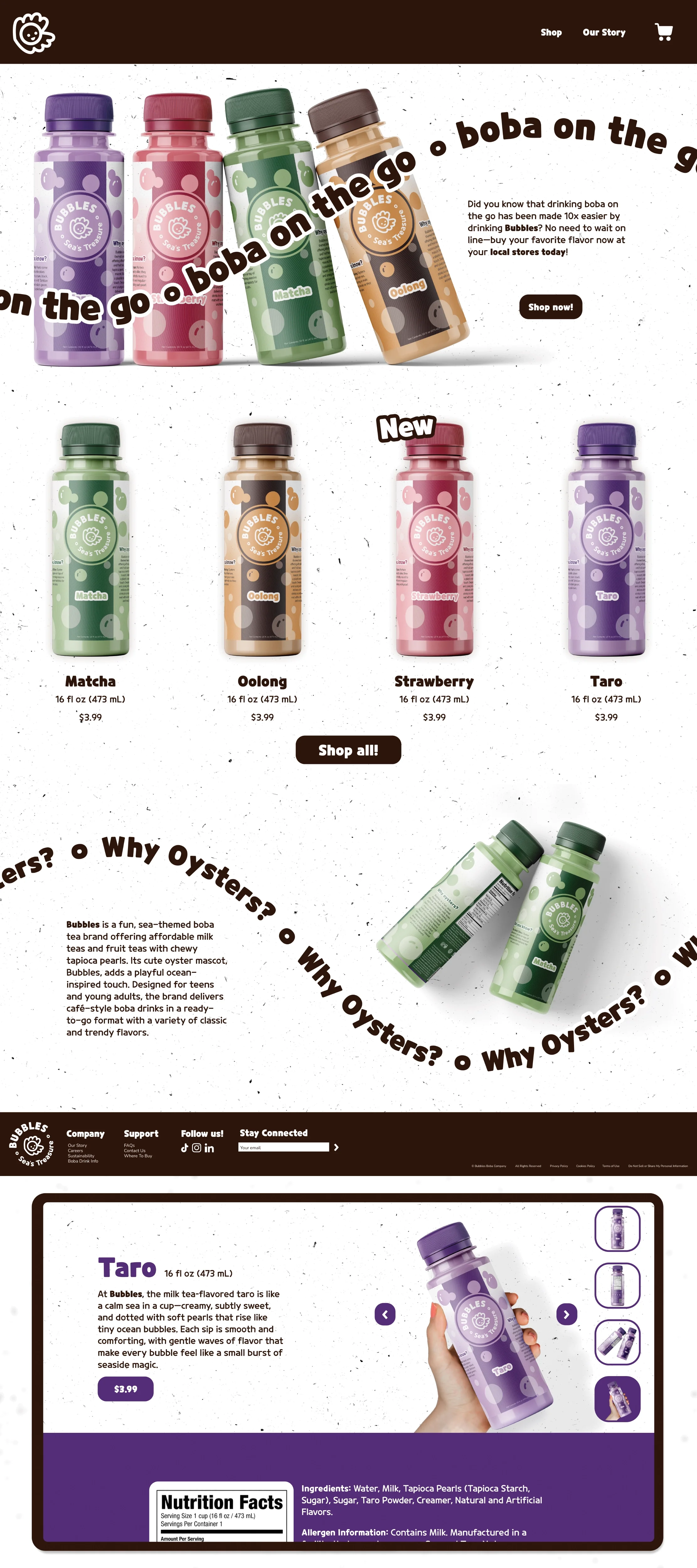
Using the same assets and design ideas from the bottle packaging, I translated the brand identity into a website to create a seamless and cohesive experience. The dark brown serves as the primary color because it is neutral enough to complement the bright, playful colors featured throughout the design. If this website were fully developed, I would have the type be animated, specifically the phrases “Boba on the Go” and “Why Oysters” moving along the path line, to make the browsing experience feel more lively and engaging. Overall, the website maintains a clean and modern layout while staying visually connected to the bottles on the shelf, reinforcing the fun and recognizable identity of the Bubbles brand.
🏁 Outcome
After creating a beverage brand and designing a mock website, I gained a much deeper understanding of what it takes to build and maintain a cohesive brand identity. Throughout the process, I learned the importance of consistency in elements such as color schemes, typography, imagery, and overall visual style to create a unified and recognizable experience for users. When working with several elements and files, I learned the important to being organized and write down important things like colors and font sizes. Receiving continuous feedback from both my professor and peers played a significant role in my growth as a designer. Their suggestions and constructive critiques encouraged me to refine my ideas, experiment with different design choices, and think more critically about how each element contributed to the brand's identity. Through this iterative process of designing, receiving feedback, and making revisions, I was ultimately able to develop a creative, fun, and memorable beverage brand called Bubbles!!! This project not only strengthened my design skills but also gave me greater confidence in my ability to create a brand that is both visually appealing and engaging for its target audience.