Fictional Project — Magazine Spread
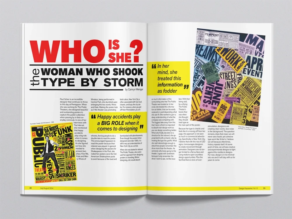
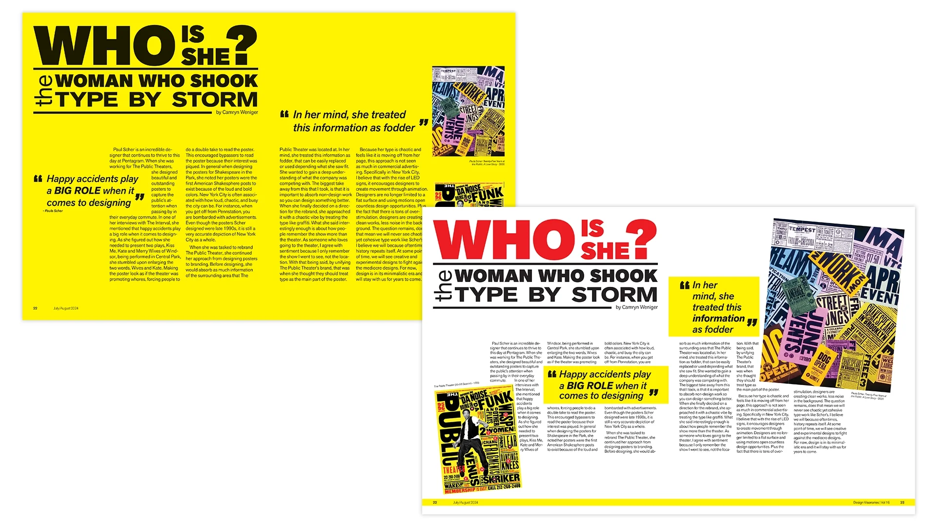
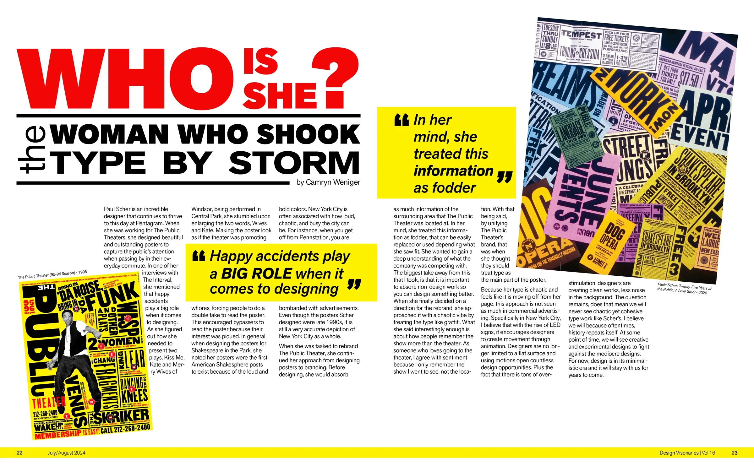
Who is She?
College Assignment
🍎 Overview
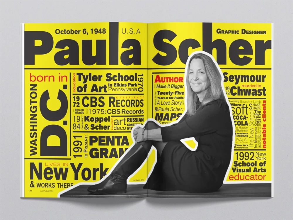
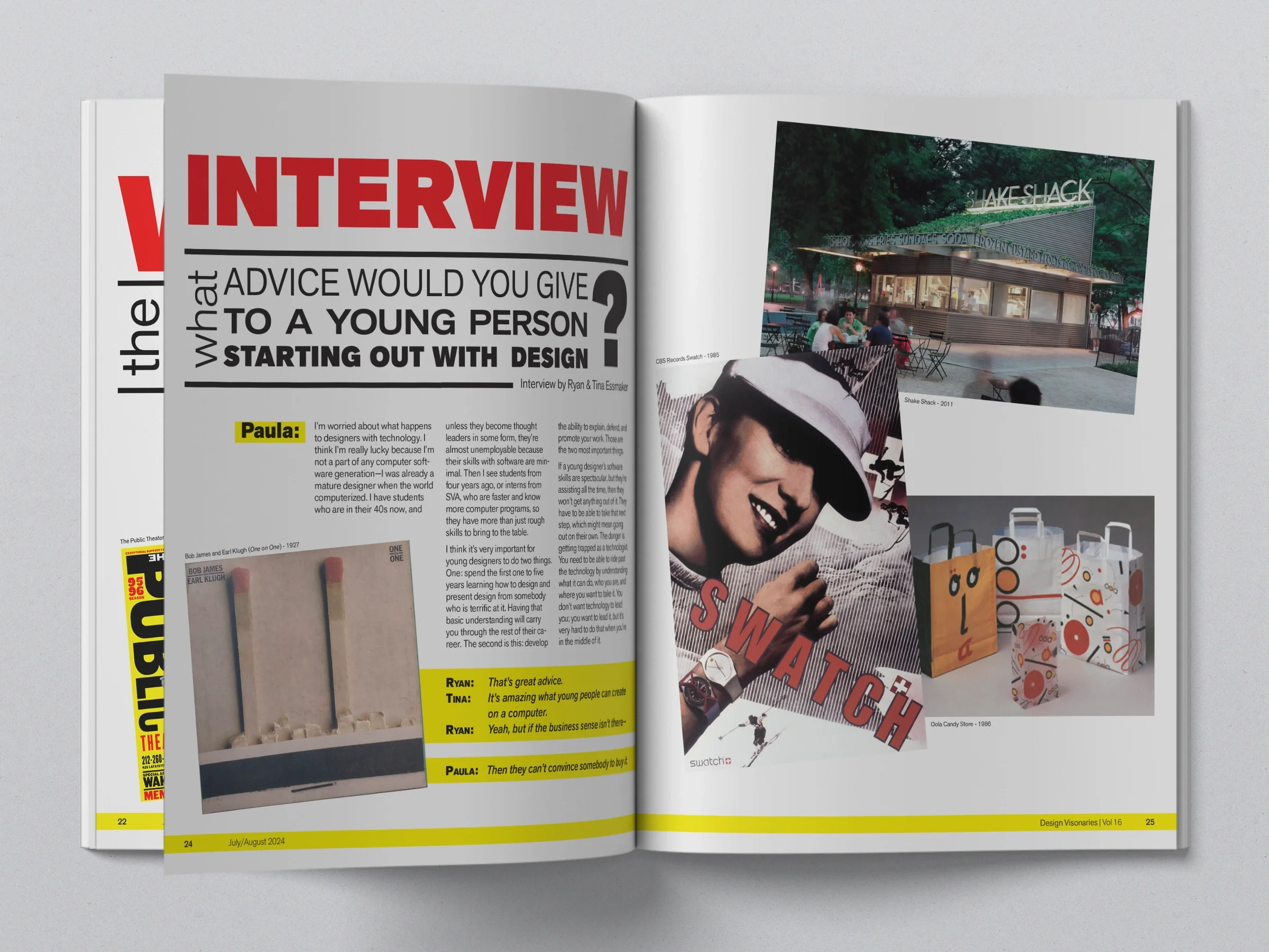
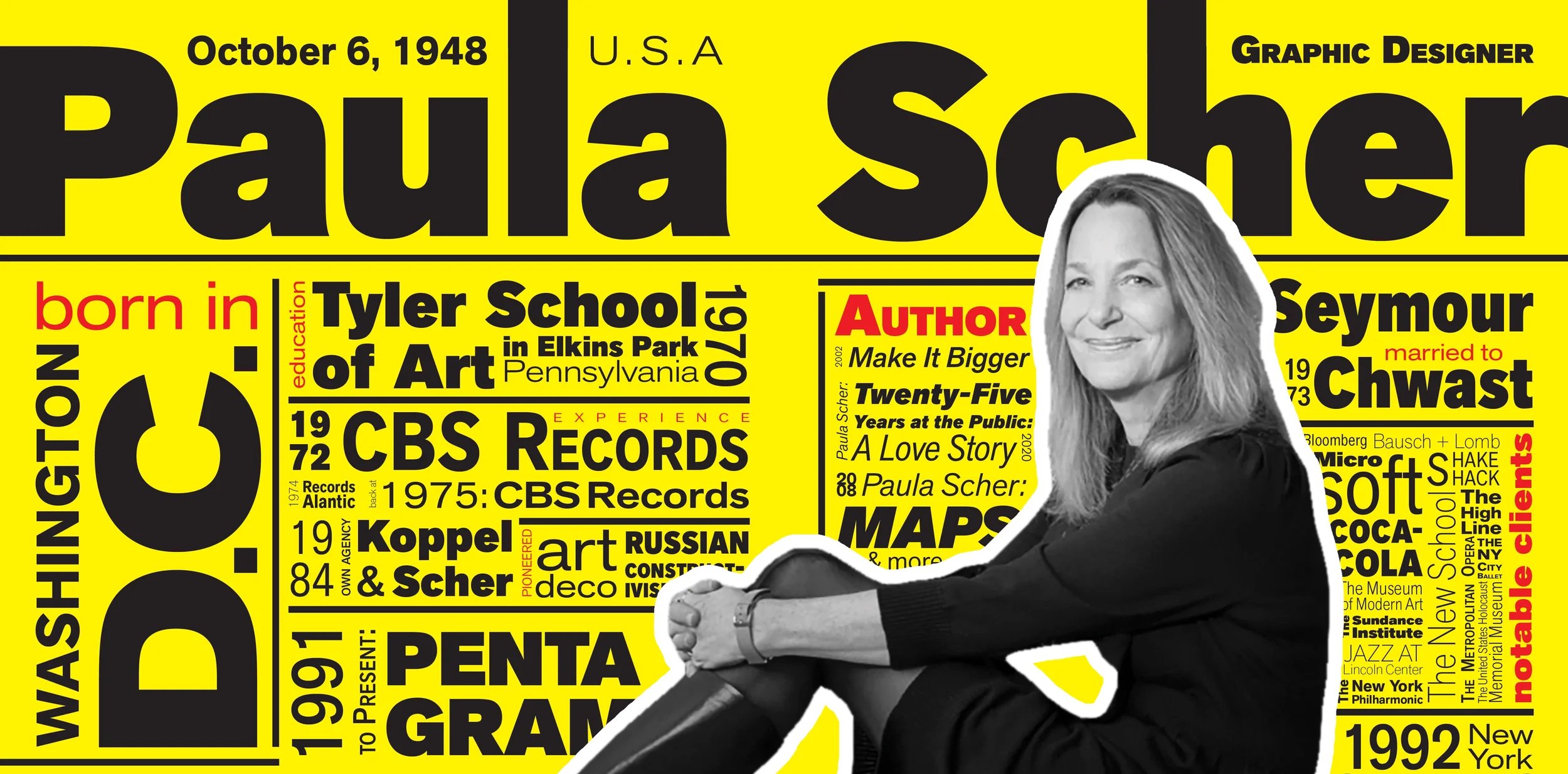
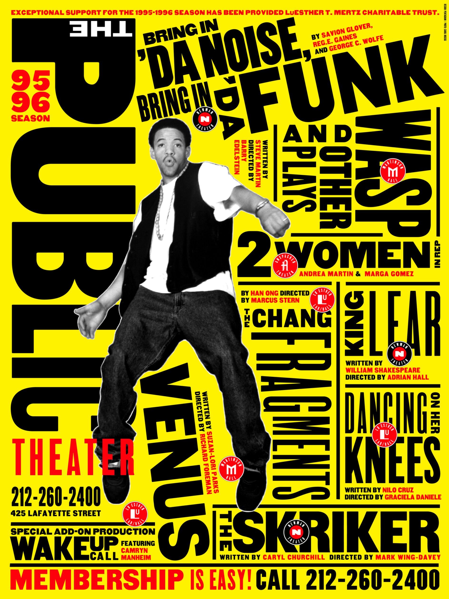
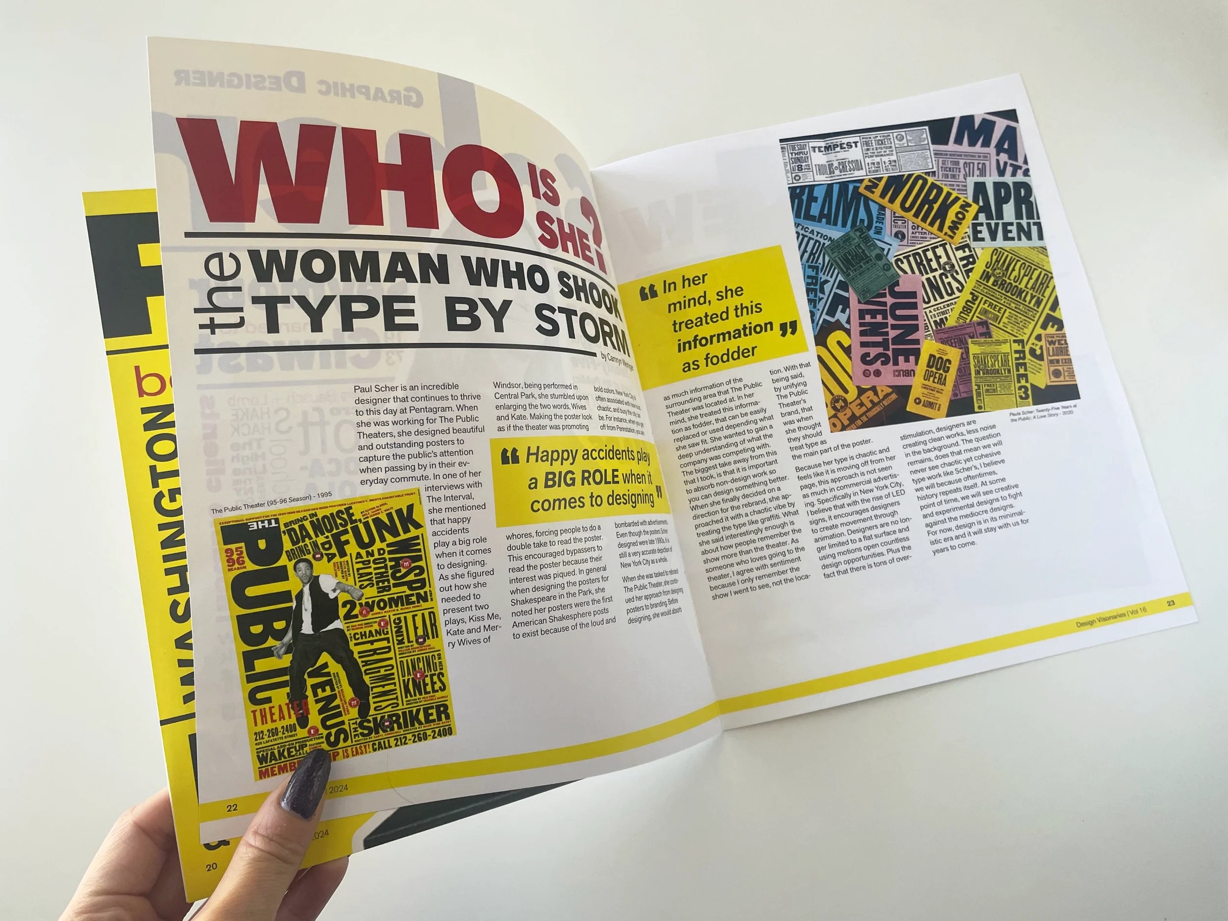
At Farmingdale State College, my Graphic Design III professor assigned a project focused on studying a designer’s work through research, writing, and design. I was assigned to Paula Scher, and created a magazine spread inspired by her signature style. The feature piece was based on her iconic The Public Theater's 1995–96 Season poster, which guided both the visual direction and overall layout of my design.
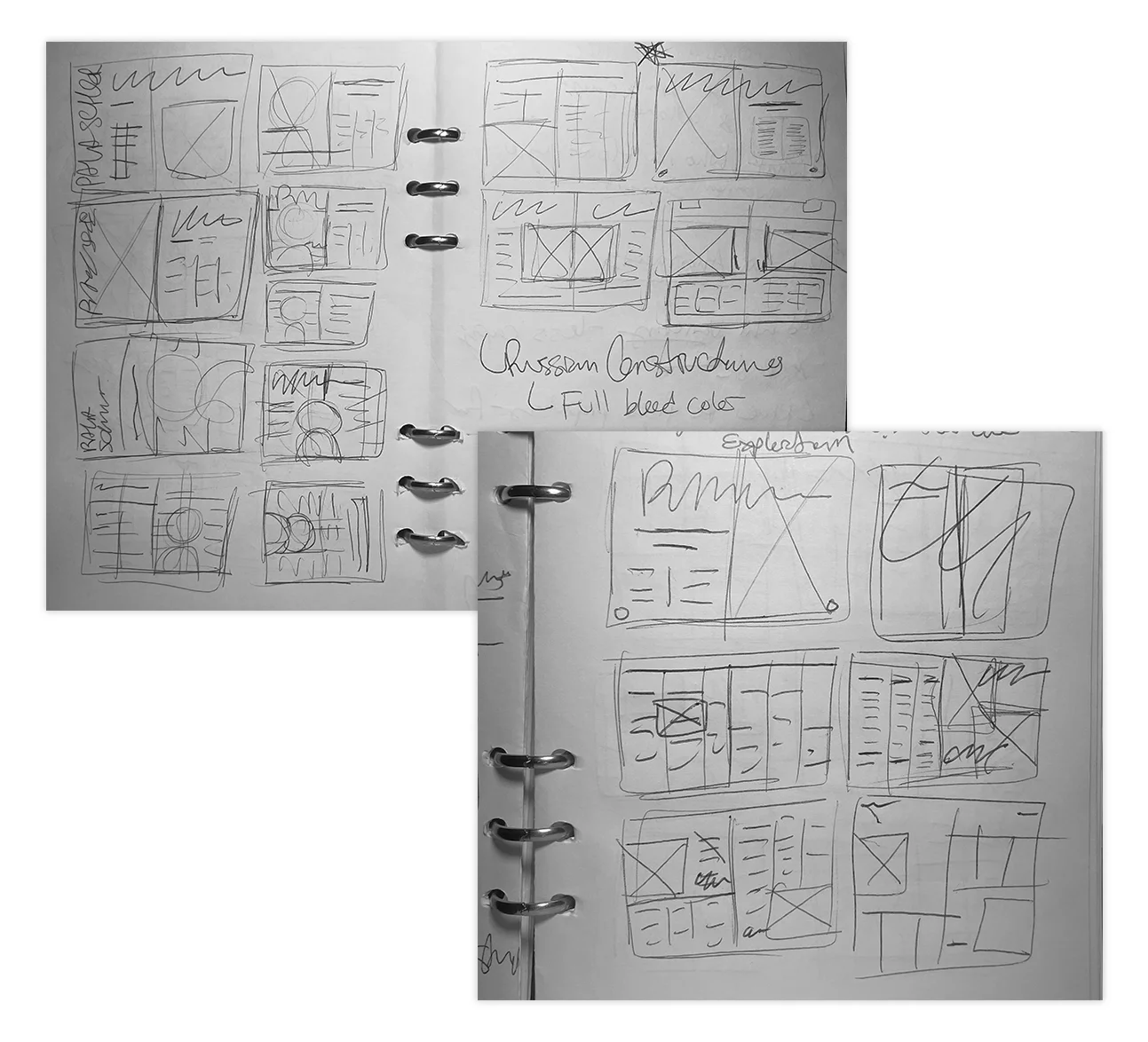
✏️ Process
After extensive research of who Paula Scher is and what she was famous for as a graphic designer, I research what type she used the most. Because my main inspiration for this featured magazine spread is based off of one of Scher’s designs, I minimize my color palette.
With consistent feedback from my professor and classmates, I was able to achieve the best that I could achieve for the entire project. From the overwhelming amount of yellow taking over to hints of yellow sprinkled throughout the magazine spreads.
🎨 Colors & Type
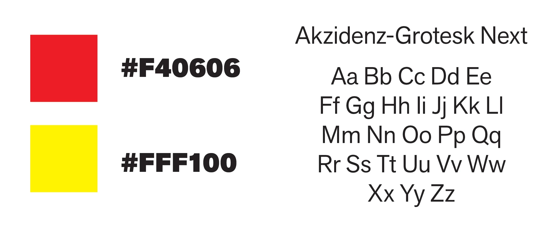
Typeface for the entire project: Akzidenze-Grotesk Next
Colors: Mainly black and white with an accent from the supporting imagery
The reasoning behind picking Akzidenze-Grotesk Next was because Paula Scher was known for using that font and the colors were picked from The Public Theater's 95-96 Season poster.
🏁 Outcome
The outcome of this magazine spread strengthened my understanding of how typography can drive a composition. Studying Paula Scher’s work pushed me to be more intentional with type. Because the type’s family was large, I was able to achieve contrast through scale, hierarchy, and placement.
Since the feature spread was so chaotic, I intentionally left a comfortable amount of negative space throughout the spread. Overall, this project helped me create more balanced and purposeful layouts.
Printed out version